Kiki Tickets | Part 2 (A Case Study)
Project Overview

You can read about the beginning process of the first half of this project on this post Project 1 post. You’ll learn about the beginning stages of my UX Design process with this project.
Tools Used
Figma
Key Deliverables
- Mid-Fidelity prototype
- Mid-Fidelity Usability Testing
- Storyboarding
- Mood Board
- Style Guide
- Hi-Fidelity prototype
- Hi-Fidelity Usability Testing
Design Process

Minimum Viable Product
During the ideation phase, I came to three MVPs or Features. The first is Transparency, users number one issue was transparency throughout a ticketing experience. The second is a Seating Map, users wanted to pick their seats from a visual map. The third was the ability to add tickets to their apple wallet.
Storyboarding
It was time for me to storyboard the process in which users will utilize my app. I created frames of the process to pick a show, then a seat, purchase and add to apple wallet.

Mid-Fidelity Wireframes
After my storyboarding was done and my sketch wireframes were completed it was time to move into the mid-fidelity phase.

Usability Testing

After my mid-fidelity wireframes were created, I did 2 rounds of usability testing. In this testing, I asked users to purchase a ticket to a certain show. During the testing, it was clear that my wireframes were set up correctly and a direct route to purchase the tickets was clear.
Mood Board
Once my testing was completed, it was time to move into the creative design process of the app. Time to get inspiration and start to put together the look and feel of the app. I saved images that spoke to me to what the heart of the app is.


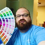
Style Guide
Once my mood board was complete. I was able to sift through the visual images as “data”. I wanted to keep the rainbow in my theme, I utilized a blended rainbow as my accent color and used CMYK colors (printer rainbow) as my color scheme. I selected Roboto as my font family because Roboto allows letters to take up as much space as it needs and ultimately, making for an improved experience for the reader.

High-Fidelity Prototype
Now that my mood board, style guide, and usability testing is completed, I was able to move into my high-fidelity design.

A:B Testing

Once my high-fidelity prototype was created, I struggled with the design a little. It felt “heavy” and something just seemed to not feel right. So I knew it was time for a:b testing. I concluded 2 tests, both tests resulted in picking the pink version over the black version.
“it feels very dark, like I for sure know the drag queens would probably pick o me”
So I quickly pivoted again and began to edit my high-fidelity and create a pink version of the app.

Conclusion
After finalizing my high-fidelity prototype, I did 2 usability testing to make sure everything was linked together and that there wasn’t anything that jumped out or didn’t make sense. My users didn’t find any issues and liked the updated screens.